Rebuilding the CS Unitec Website


When I joined CS Unitec, I had no idea I would eventually lead the redesign of a 10 tool companies in one industrial tools website, but that’s exactly what happened. What started as a marketing role quickly evolved (with my push and passion) into a full scale UX and content strategy challenge. With limited resources, no design team, and no clear direction, I took initiative to research, reimagine, and rebuild a site that not only worked better for users, but also for the sales and operations teams behind it.
CS Unitec is a power tool manufacturer and distributor with a product catalog of over 24,000 SKUs. The company’s outdated website had major usability issues, poor navigation, and inconsistent product data; all of which impacted sales, quoting accuracy, and customer experience. As the in house UX lead, I initiated and led a full website redesign focused on improving usability, organization, and internal workflows.
Step 1: Addressing the Problem
When I started exploring the CS Unitec website, I found users were facing several key challenges that made finding products and getting quotes difficult:
The site had three separate main menus, which created confusion rather than clarity.
It took users up to five clicks just to reach a product page - way too many steps for quick access.
Product pages were inconsistent in layout and design, especially the specification tables, making comparisons frustrating.
Analytics from GA4 showed users mostly ignored the menus and relied heavily on the search bar, signaling poor navigation.
The quote submission process was overly complicated, requiring users and sales reps to manually copy and paste product info through multiple back and forth steps, causing errors and delays.


Research & Strategy
Once I had a clear view of the problems users were facing, I began formalizing my UX research strategy to guide the redesign with real data, not assumptions. I wanted to understand both the external user needs and the internal workflow pain points, so I approached it from both sides.
Competitive & Comparative Analysis
I audited websites of leading tool companies to understand how they structured their navigation, organized product content, and guided users through purchasing or quoting workflows.
I took note of common UX patterns, effective IA (information architecture), and features that simplified the user experience, which helped define what “good” looked like in this industry.
Content Inventory & Site Mapping
I performed a full content audit of the current website.
This revealed a large number of duplicate or outdated products, messy categorization, and inconsistent labeling. You can see this in the horribly messy site map featured below.
I created a new site map that restructured the navigation into a more intuitive, simplified hierarchy; reducing unnecessary layers and bringing key products closer to the surface. The new map was laid out in an Excel sheet with far too much information to show here, but the evidence can be seen in the layout of the new website.

Interviews When Possible
As UX Research is my passion, I knew the importance of interviews when it comes to the research process. Though I didn’t have the means to do a full interview process like I hoped, I was able to gather valubale information working in sales and asking my coworkers questions such as:
What questions customers asked most often.
Where errors happened in quoting or product selection.
What they personally struggled with when using the site internally.
These “interviews” helped me prioritize features that would solve real internal pain points, not just surface level design issues.
I also gathered company permission to send out surveys internally to gather more opinions anonymously.

Google Analytics Review
I used Google Analytics 4 to validate what I was seeing qualitatively.
Key finding: Users were skipping menus entirely and using the search bar instead, a red flag that the navigation wasn’t working. See below different months of data showing similar results. First viewed page is home, second is search.
This informed my decision to simplify the site’s IA and restructure product access paths.

Concluding My Research
I compiled all findings into clear themes:
Navigation is overwhelming and ineffective.
Product info is hard to access and inconsistent.
Submitting/receiving a quote is a difficult process for both the customer and sales team.
Users don’t trust the site to help them find what they need.
These insights directly influenced the design direction and the features I prioritized in the next phase.
Step 2: UX Solutions & Design
Once I completed my research and synthesized the key problem areas, I moved into the design phase using everything I’d learned to start reimagining the site from a user first perspective.
Wireframing
I created low fidelity wireframes based on the pain points uncovered in my research.
These wireframes focused on:
Simplifying the site’s structure
Improving product findability
Enhancing visual clarity and consistency
I gradually evolved the wireframes into mid fidelity mockups, which I presented to the marketing team for feedback.
After incorporating their input, I developed mockups that reflected a clearer vision for the new site.
This architecture was approved by leadership and served as the foundational blueprint for the rebuild.
Individual Product Pages
Homepage Improvements
Introduced a cleaner, more visually appealing layout.
Focused on building trust with users by clearly showcasing:
Company capabilities
Featured tools
Tools by power type
Tools by industry
Reorganized the content to be easier to digest, with clear CTAs and visual sections that helped users quickly understand what the company offers.
Menu & Navigation
One of my many projects was designing a new mega menu navigation system.
The old site forced users to click through multiple layers just to reach a product, usually 4 to 5 clicks.
My mega menu concept allowed users to drill down into product categories in far fewer clicks, surfacing more options at once and organizing them in a logical, visual hierarchy.
Although the final site used a different menu layout than my original design due to executive opinion, the core idea of consolidation and usability remained.
The new menu is more intuitive, consistent, and user friendly than the original.
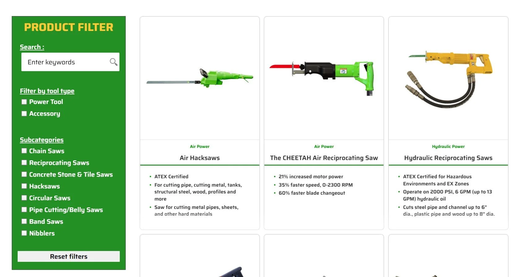
Product Category Pages
Proposed the addition of a product filtering system, which didn’t exist on the original site.
Helped users sort through tens of thousands of SKUs by selecting key attributes.
Made finding the right product faster and more intuitive.
This area saw the most extensive improvements.
Designed a consistent layout for all product pages, solving the inconsistency issues from the old site.
Introduced a new Quote Cart system:
Users could select product variations (like size, voltage, material), which dynamically generated the correct SKU.
Instead of buying directly, users could “Add to Quote Cart,” creating a familiar eCommerce-like flow adapted for B2B quoting.
This drastically improved the quoting process for both users and internal sales teams.
The Rebuild: Part 1
As the project moved forward, I also led the evaluation of which platform we should use to build the new site, weighing cost, usability, accessibility, flexibility, and long-term maintainability.
Platforms Considered
Drupal 10
MODX
WordPress (self-hosted, WordPress.org)

WordPress the Winner
I chose, and the rest agreed that WordPress was the most strategic, user friendly, and cost effective option for the company.
Industry Credibility
Powers over 50% of websites globally including major government websites.
Strong, well supported open source community.
Ease of Use & Editing
Unlike developer heavy platforms like Drupal or MODX, WordPress allows for instant front end editing, ideal for non technical staff.
Offers a huge library of themes and templates, many already ADA compliant.
Accessibility & UX Support
More plugin options, including tools focused on accessibility, performance, and SEO.
Surpasses competitors in flexibility and user focused features.
Security Considerations
WordPress has automatic security updates and a dedicated security team.
While it has more reported vulnerabilities, this is largely due to its scale, and risks can be mitigated with proper maintenance.
Cost Efficiency
WordPress Business Plan: $25/month or $300/year
MODX Business Plan: $150/month (plus potential dev costs)
Drupal 10: Free, but requires a dev team estimated cost: up to $40K with 8+ week timelines (source: Forbes)
Based on all this, WordPress offered the best balance of usability, scalability, accessibility, and cost, especially for a small team with limited developer resources.
Setting Up & Finding Support
Once my designs were approved and we chose WordPress as our platform, I moved into the development phase, where I led the build from the ground up.
I got the company set up with WordPress.org and secured the appropriate licensing and hosting.
I was approved to find and onboard a development team to support backend functionalities and help troubleshoot any technical roadblocks.
I created page templates in WordPress based on the wireframes I had designed.
From there, I began the enormous task of migrating all content manually from the old Drupal 7 site.
Why manual?
The original site had no export functionality for product information.
Every detail had to be manually rebuilt. Including:
Product titles, descriptions, and specifications
Every single SKU and variation
All media files (images, PDFs, videos)
Product attributes (used to create variations that powered the quote cart system)
Navigation structure, menus, tags, categories, and taxonomy
Every quote cart interaction element and form logic
I was the sole person doing this content migration. Thousands of hours, no automation, no import tools.


The Rebuild: Part 2
Halfway through the project, my boss left the company and my leadership changed hands.
The direction of the project shifted, and the decision was made to bring in a new development company to continue with creating a new design and finish the build.
Fortunately, I built a strong relationship with this new team and we worked together seamlessly.
New Design & Filtering
The new development team used my foundational build and layered on stronger visual design elements, a welcome change, as graphic design is not my primary strength.
They introduced:
A cleaner, more modern design layout
A more polished tool finder filter system
I continued to lead all data population efforts, as some data got lost in the switching of environments:
I filled out massive flat files with product and variation data
Their developer wrote scripts based on my structure to implement filter functionality
All content management and updates still go through me post hand off
While the design evolved, the information architecture, navigation, and quoting logic were all built on top of the structure I created. This project was, and still is, something I carried from research to reality.
The New Homepage
Category Product Filtering
Product Page & Quote Function
Final Reflections:
This project pushed me harder than anything I’ve worked on before. I was the sole UX researcher, designer, and builder on a massive, complex B2B site with no roadmap, no clean data export, and very little support at the start. What began as a UX challenge quickly became a full scale, cross disciplinary undertaking, and I took it on because I never back away from a challenge.
I learned that in the real world, UX doesn’t exist in a vacuum. It’s tied to operations, data, internal processes, leadership dynamics, and technical constraints. I had to adapt constantly. Not just as a UX architect, but as a strategist, a project manager, and a problem solver.
Some of my biggest takeaways:
UX is research led, but execution dependent. If you can’t bring your ideas to life in the real system, they don’t help users. I learned how to bridge that gap.
Perfect isn’t always possible but progress is. Even though the final site design evolved beyond my original mockups, my UX decisions became the backbone of the rebuild.
Resilience is part of the job. Working alone through most of this project was incredibly difficult. But it showed me how much I’m capable of even in high pressure, high stakes situations.
The right team changes everything. Once I was able to collaborate with the new development team, the project finally had momentum and support. It reminded me that UX is always better when built with others.
In the end, the new website is faster, easier to navigate, and far more intuitive for both end users and internal teams. The quoting process has been simplified, the product structure is consistent, and the navigation now reflects how users actually think.
This project gave me the real experience of leading a redesign from start to finish, and I’m incredibly proud of what I built.